Client — British Hospital
The brand evolution of British Hospital, a leading institution in medical excellence.
Project Overview
The Challenge
With over 170 years of heritage, Uruguay’s British Hospital projected an identity that showed the clear passage of time. Its brandmark—featuring a traditional lion and outdated graphic elements—combined with the absence of a unified visual system, resulted in fragmented brand versions, typographic clutter, and a lack of clear guidelines for sub-brands, campaigns, and digital applications.
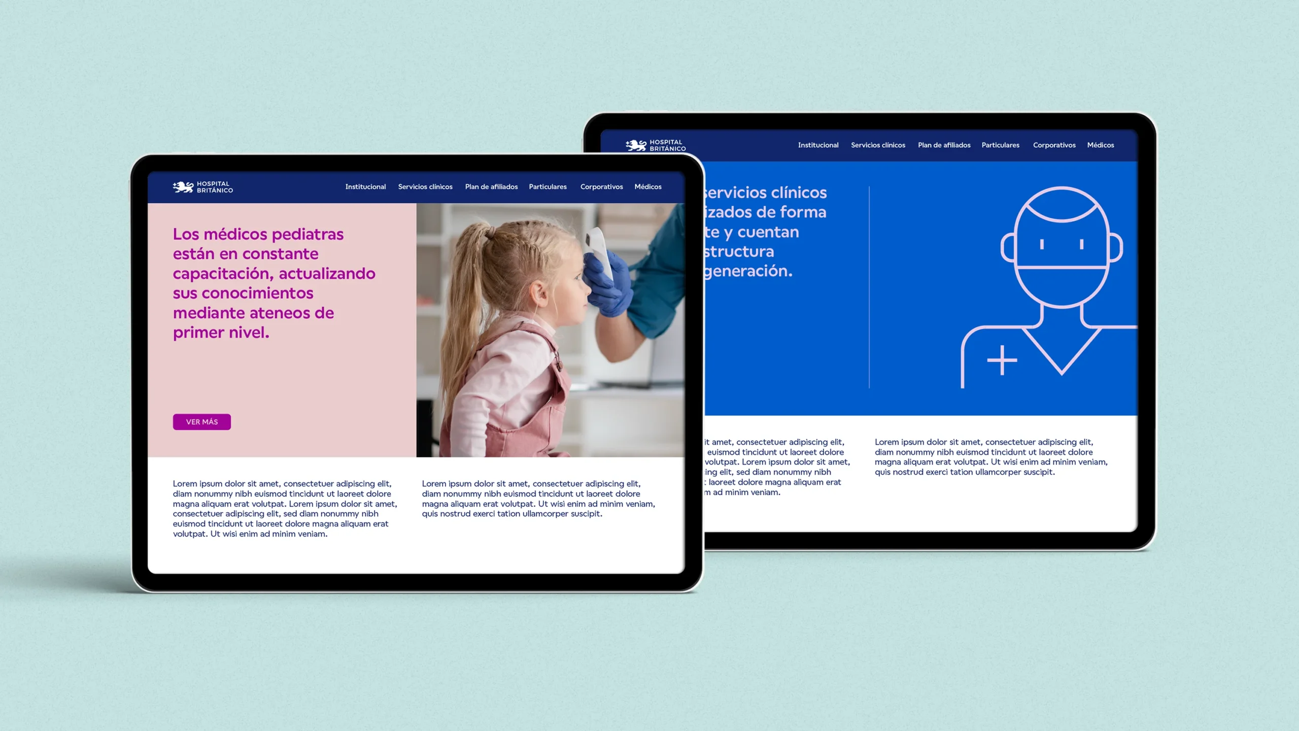
Furthermore, the existing identity had not been conceived to coexist within contemporary digital environments, hindering its seamless implementation across social media, digital platforms, user interfaces, and modern communication channels.
The challenge lay in evolving the brand while honoring its historical legacy and British roots, simultaneously constructing a robust visual system capable of expressing the institution’s defining values: trustworthiness, professionalism, empathy, continuous improvement, and excellence.

Our Approach
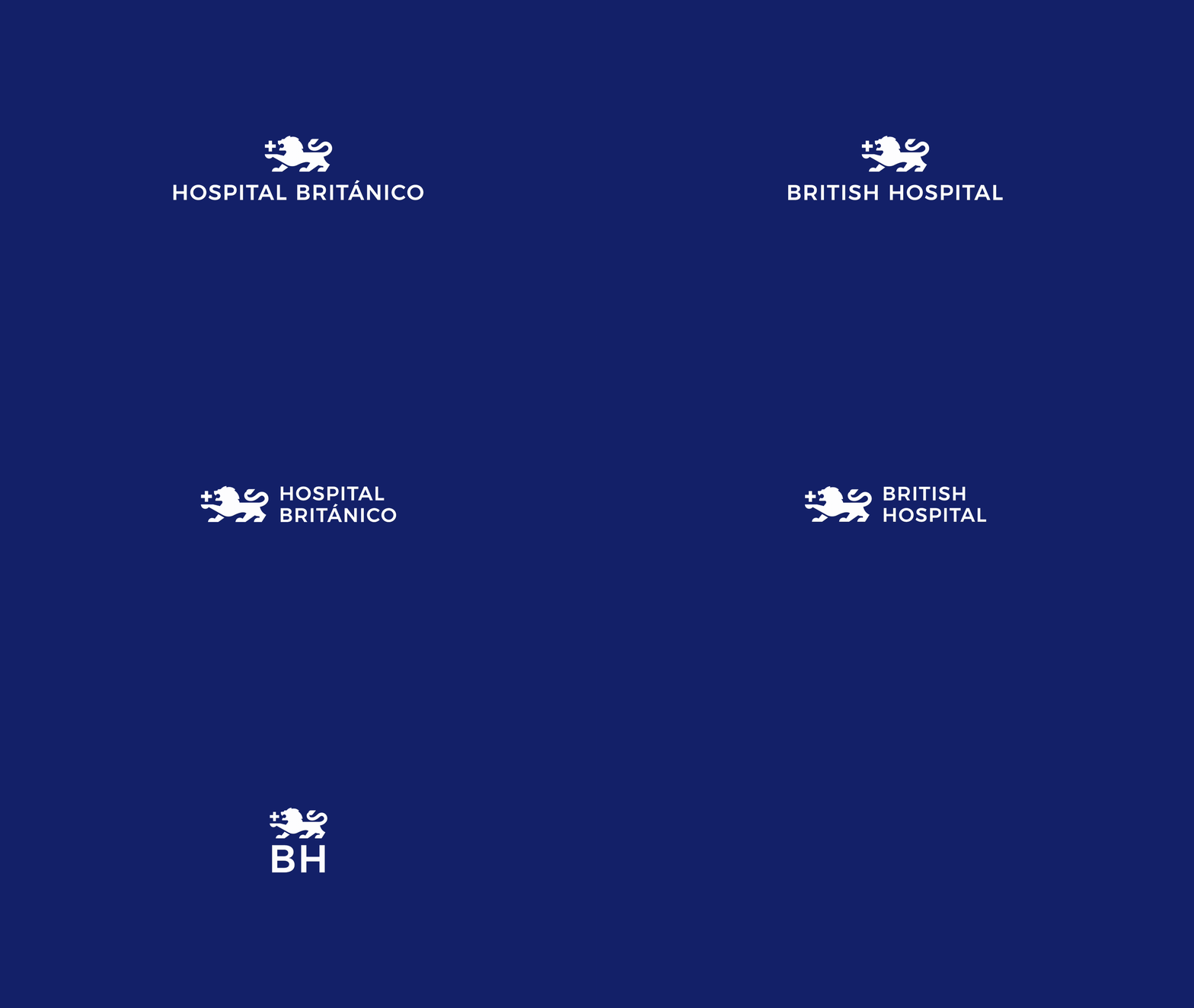
We developed a conservative revitalization focused on modernizing the brand without losing recognition or its symbolic heritage.
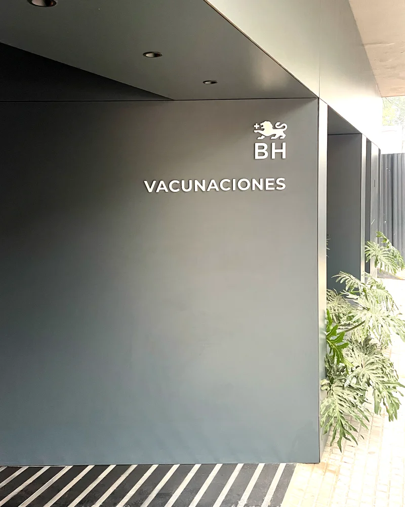
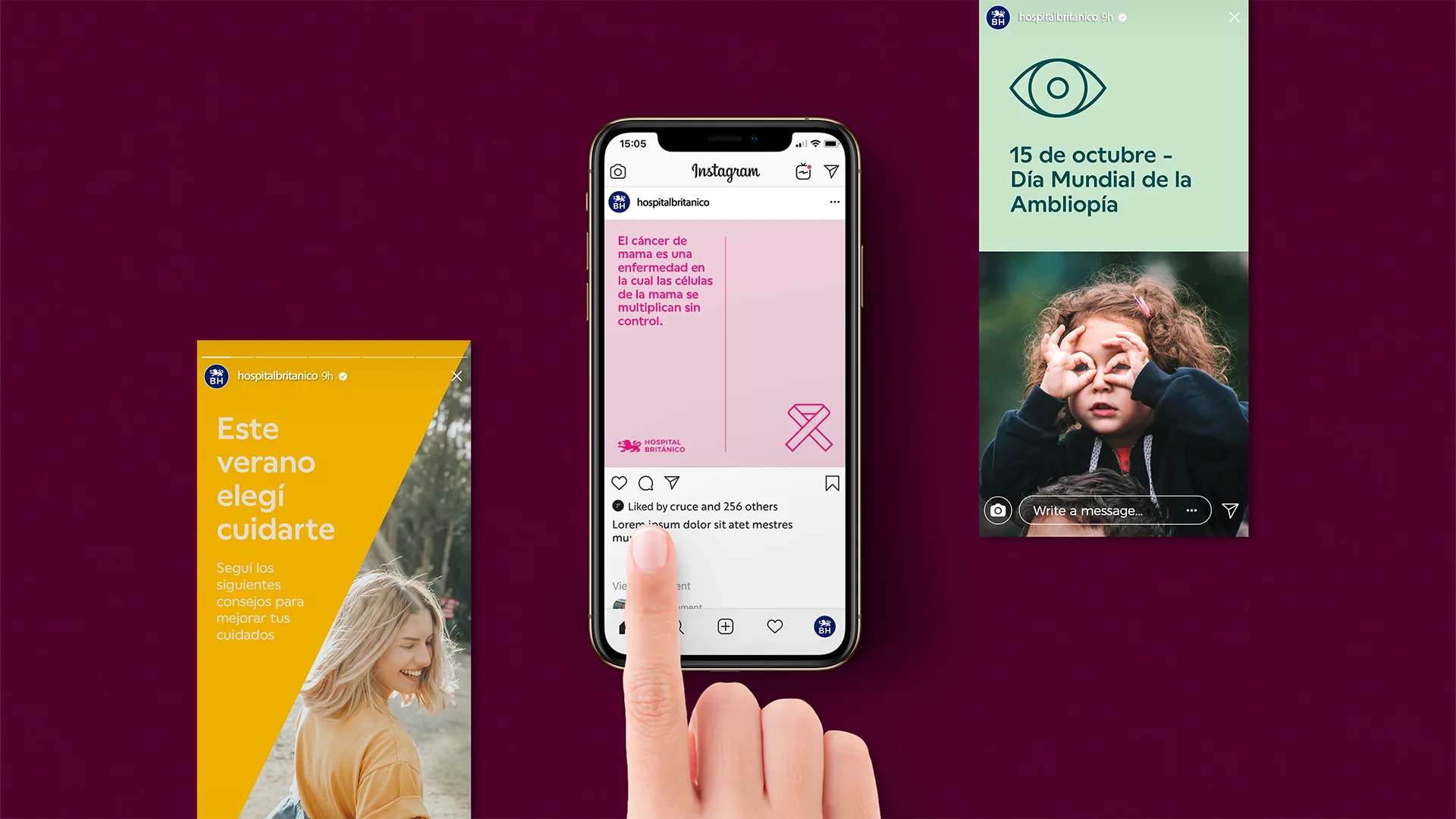
We simplified the brandmark, updated the lion motif using a more contemporary visual language, and optimized the color palette to enhance its performance across both physical and digital media. We also designed a synthesized version of the brand specifically tailored for social media, favicons, and digital applications.
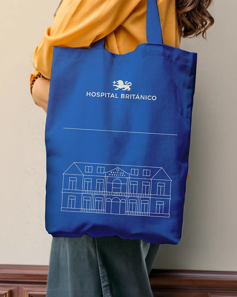
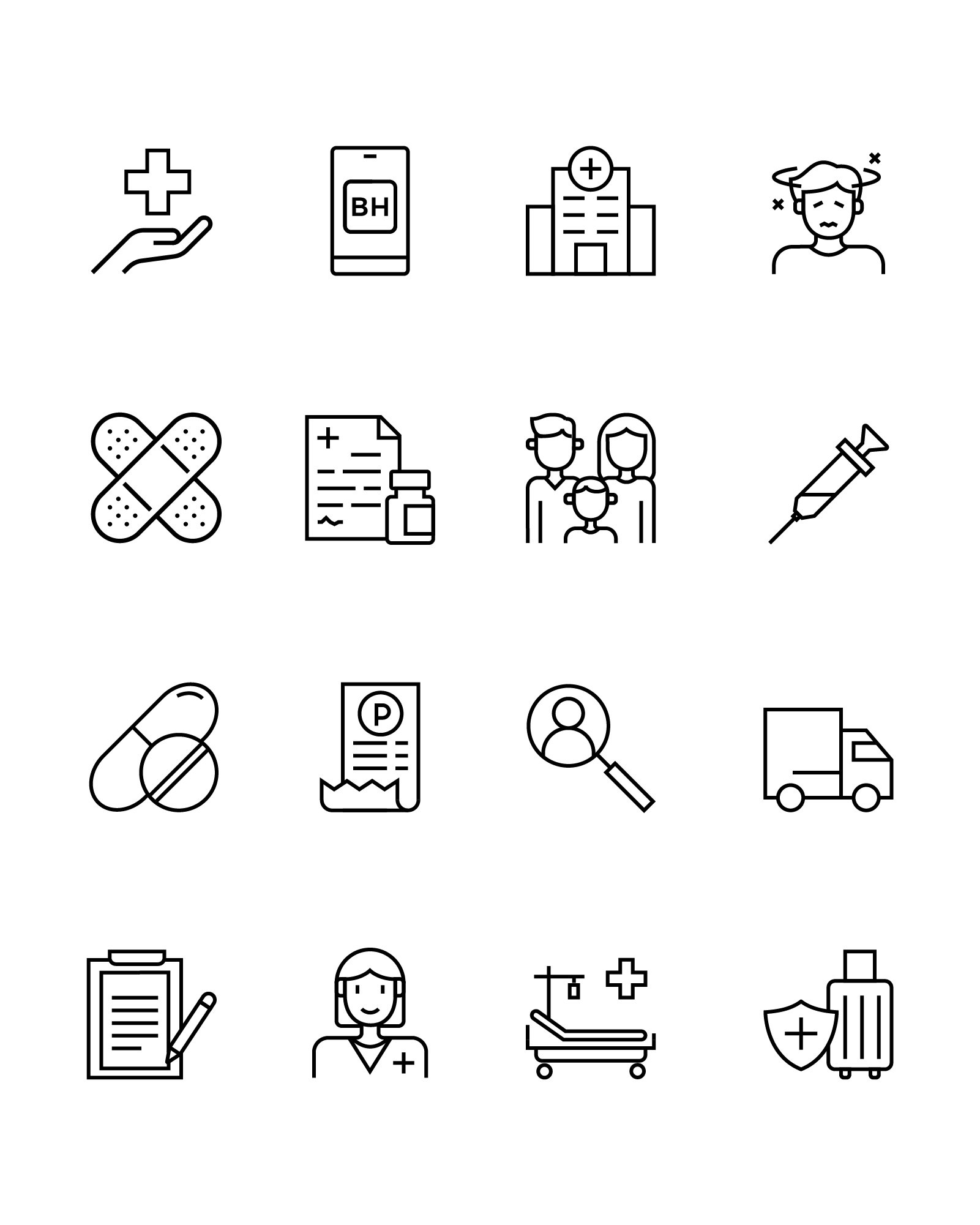
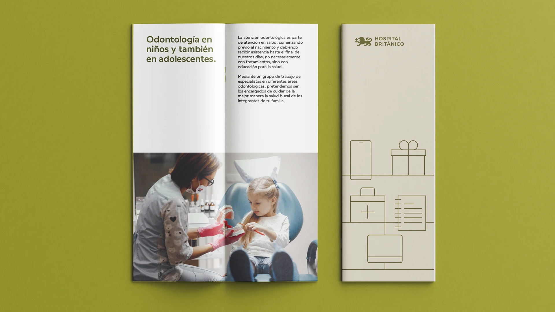
Building from there, we constructed a comprehensive visual system comprising clear implementation guidelines, new typography, criteria for sub-brands, a proprietary iconography system, and graphic guidelines capable of streamlining all institutional communication.
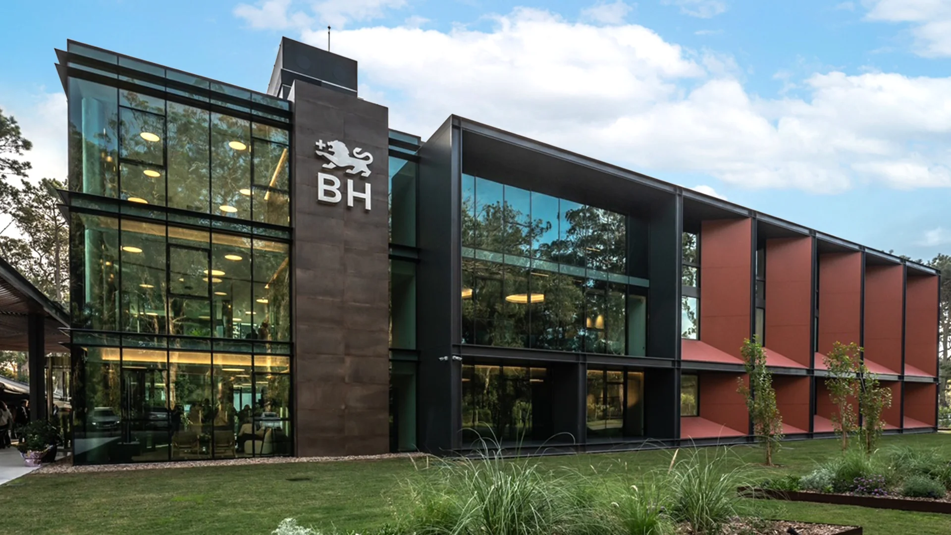
Graphic System - Union Flag
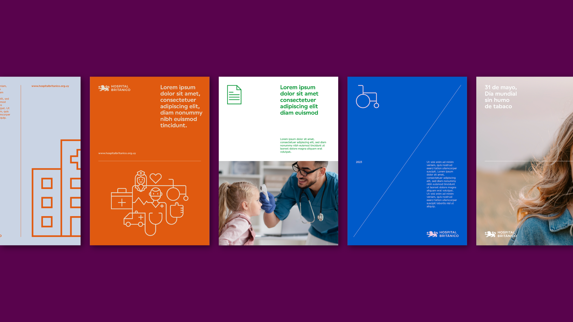
As a core element of the project, we developed a proprietary graphic system called Union Flag, inspired by the compositional structure of the United Kingdom flag.
This direction stemmed from the hospital’s British roots and the intent to leverage an iconic, highly recognizable symbol deeply associated with the institution’s cultural identity. Grounded in this logic, we built a flexible and contemporary visual language capable of creating dynamic compositions, organizing content, and bringing a distinctive personality to all of the hospital’s communications.
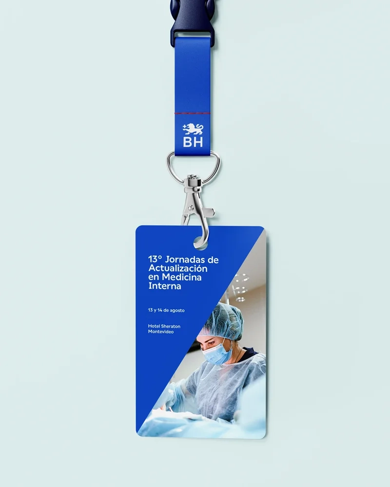
The system functions as a versatile, cross-functional tool that unifies campaigns, corporate assets, internal communications, and digital environments under a single visual framework.


Color System
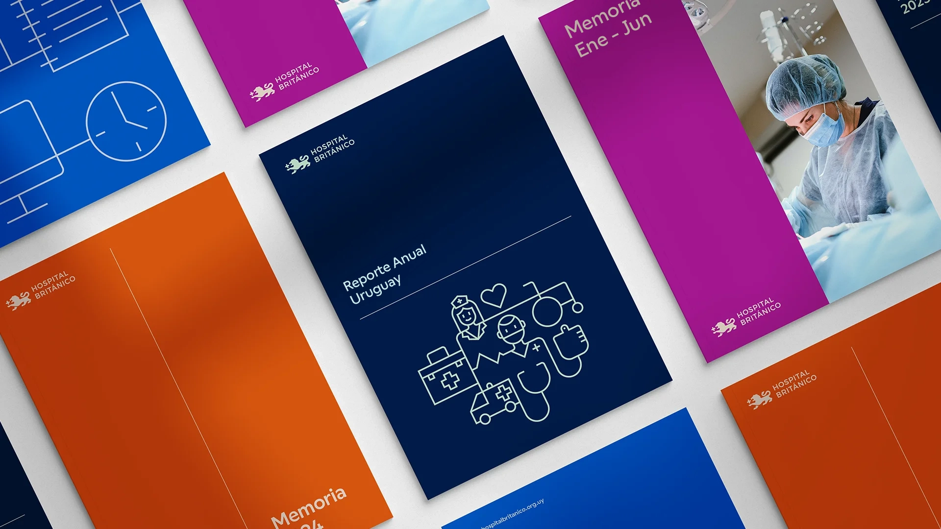
The graphic system also incorporates a flexible color logic based on various combinations of color triplets.
This allows for a vast diversity of communication materials while maintaining visual coherence, seamlessly adapting to specific health-related themes where certain colors carry widely recognized associations—such as breast cancer awareness, blood donation, autism, and oncology prevention, among many other initiatives.

The Outcome
The result is a robust, contemporary, and consistent identity capable of honoring the hospital’s historical trajectory while elevating and streamlining all touchpoints under a single brand standard.
The new identity has professionalized corporate communications, optimized the coexistence of multiple departments and sub-brands, and prepared Uruguay’s British Hospital to respond with coherence and flexibility to the demands of an increasingly digital and dynamic ecosystem.