Client — Inka Corn
Inka Corn | Reclaiming the Global Shelf
00.
Project Overview
The Challenge
Inka Crops was losing market share to new international competitors. They required a visual refresh that could connect with a younger audience and ensure high visibility in hyper-competitive export markets.
Our Approach
01. Brand & Packaging Redesign
02. Social Media Design System
01.
Brand & Packaging Redesign
The Solution
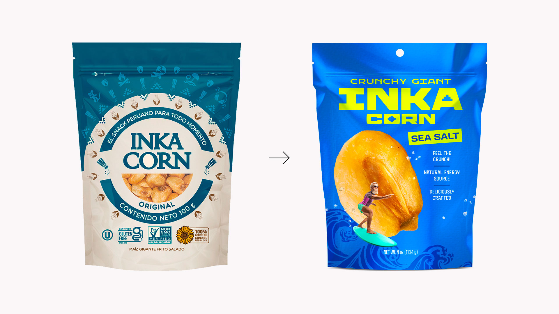
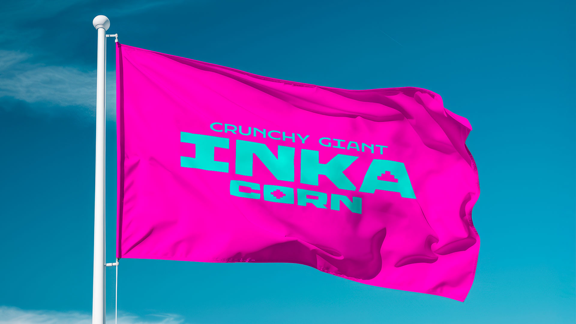
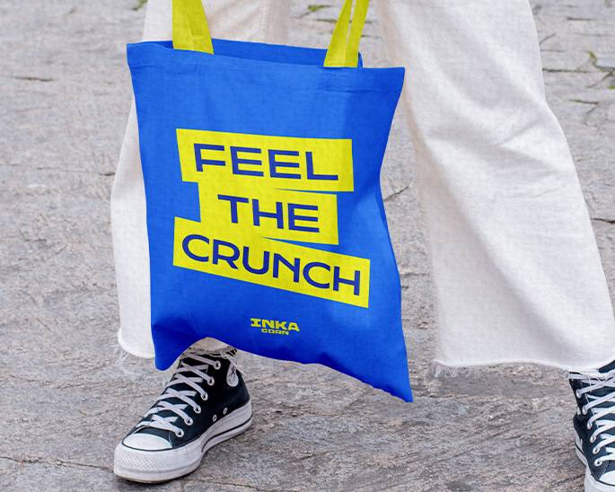
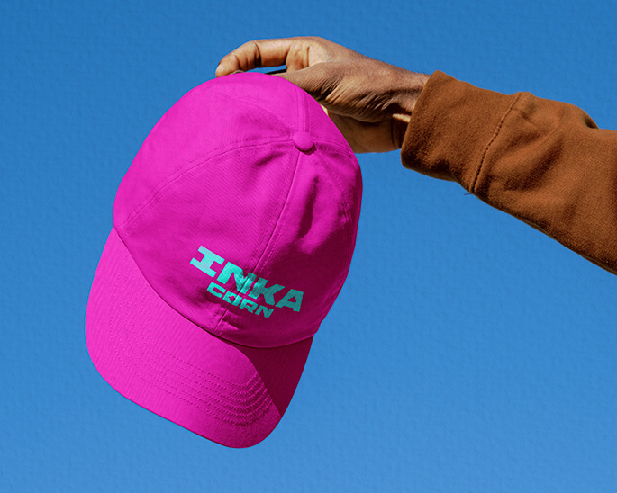
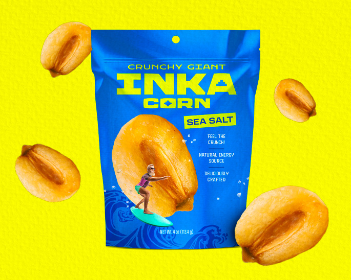
– Evolved Identity: A logo featuring bold, heavy typography inspired by solid Inca architecture, balancing Peruvian heritage with modern aesthetics.
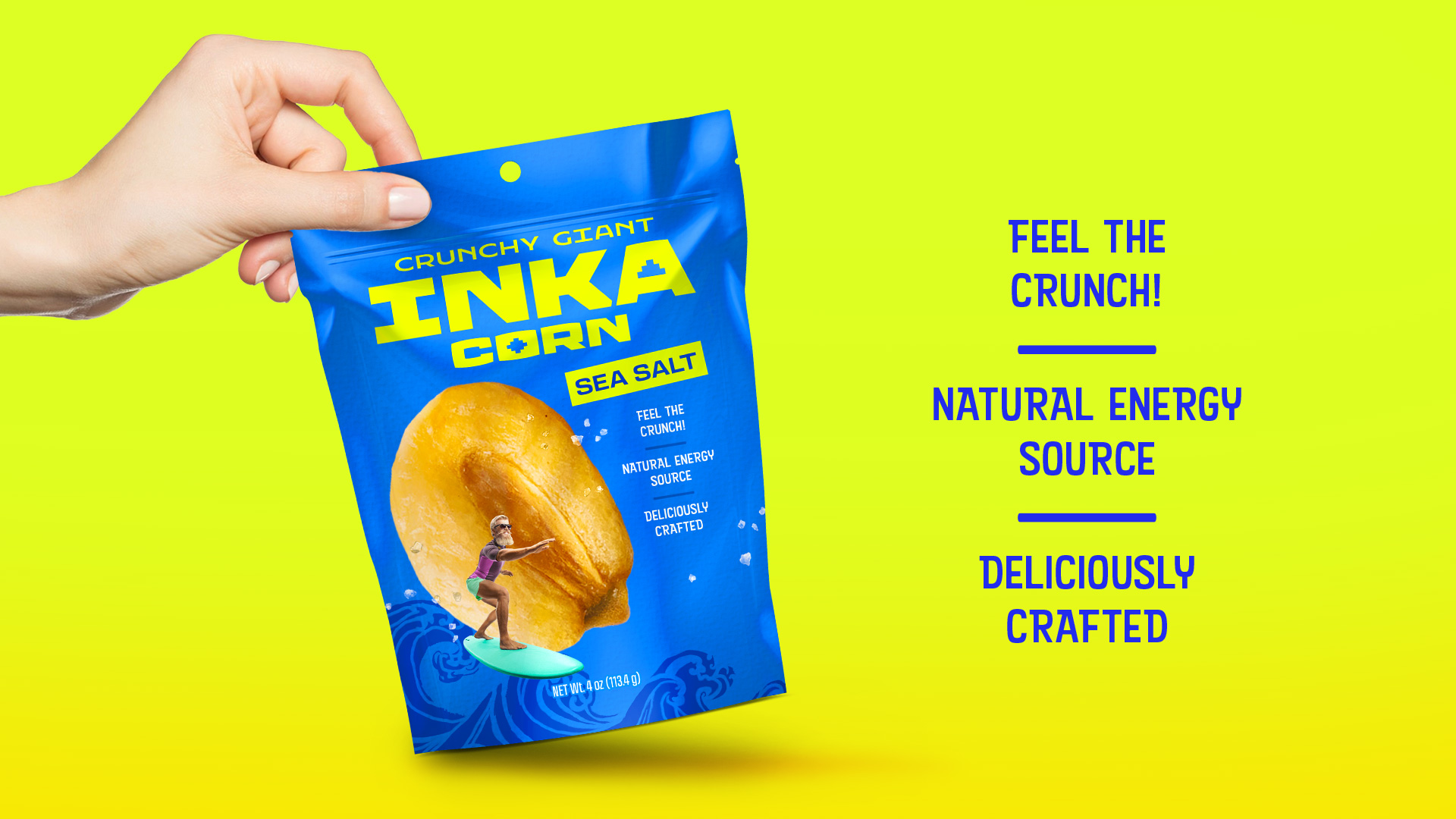
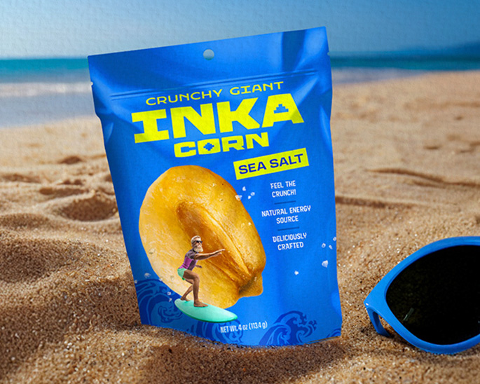
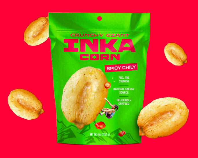
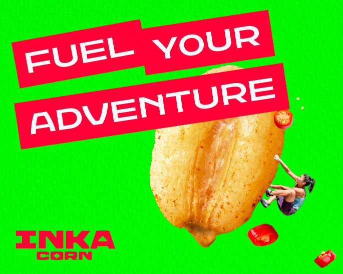
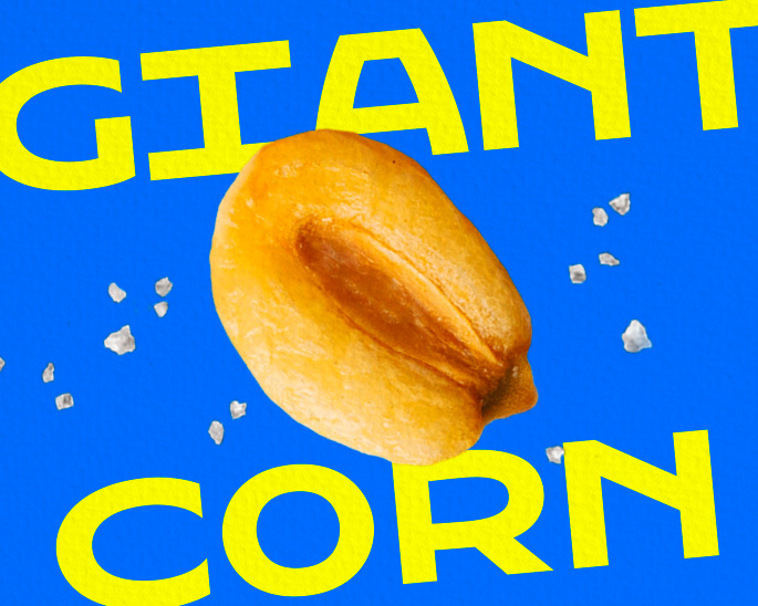
– Storytelling: We transformed the product itself into a “Giant Corn” element on the packaging. By integrating these oversized kernels with extreme sports illustrations (surfing, climbing, kayaking), we created a heroic visual scale that links the snack to high-energy, larger than life moments.
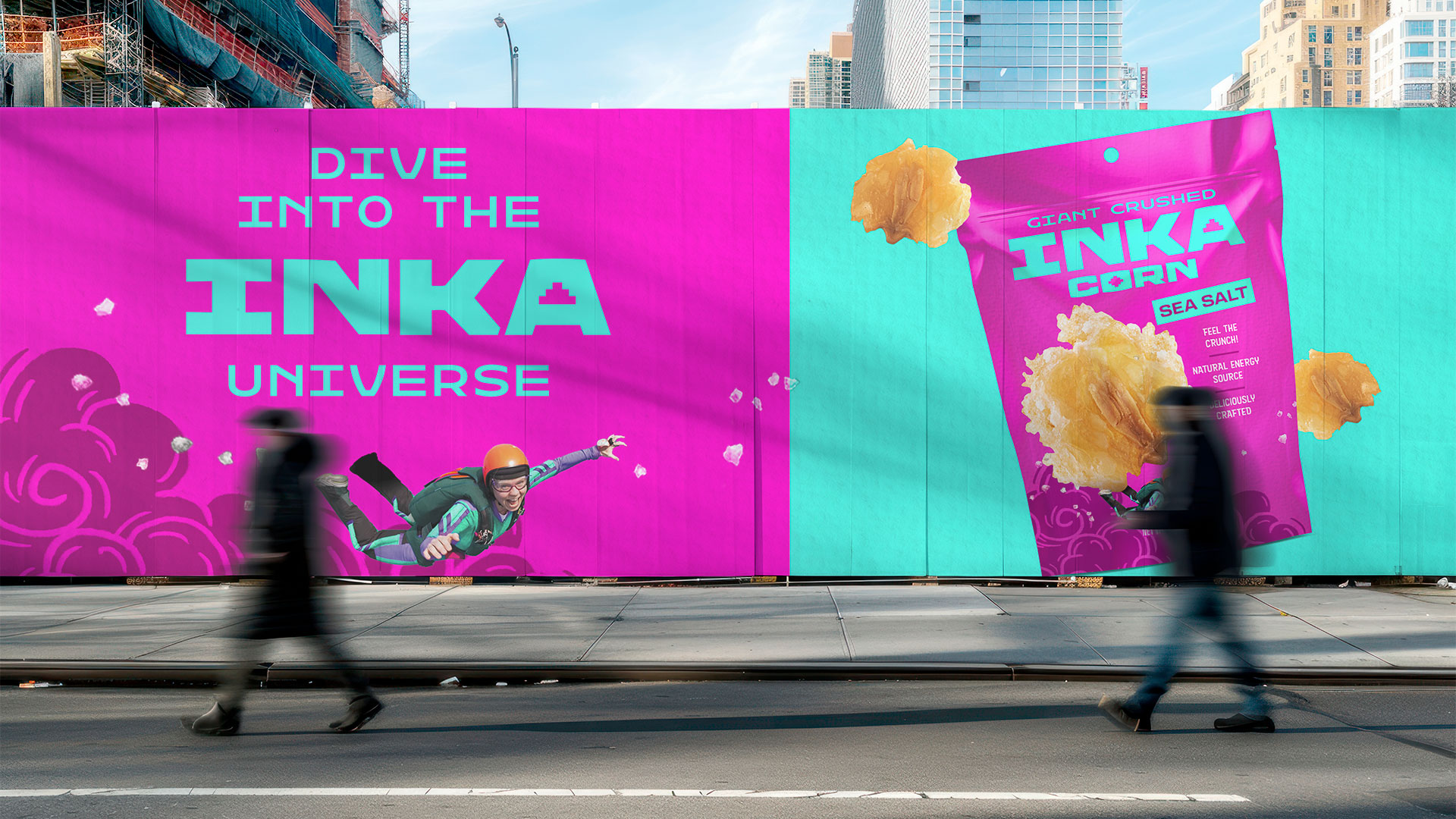
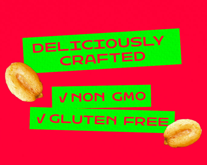
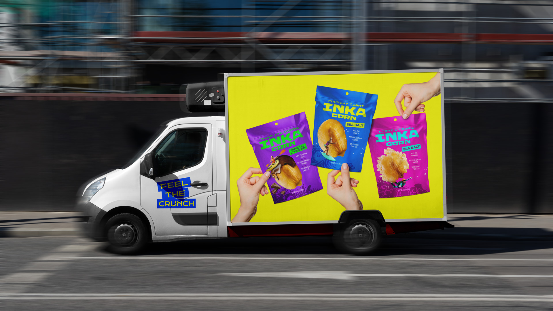
– Retail Impact: Strategic use of solid colors and bold hierarchy to cut through the visual noise of the category and ensure instant brand recognition.

02.
Social Media Design System
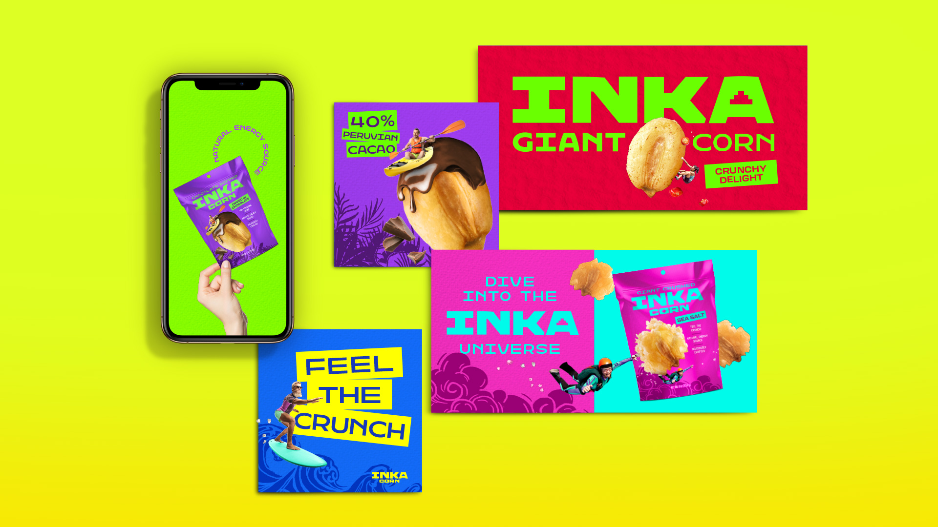
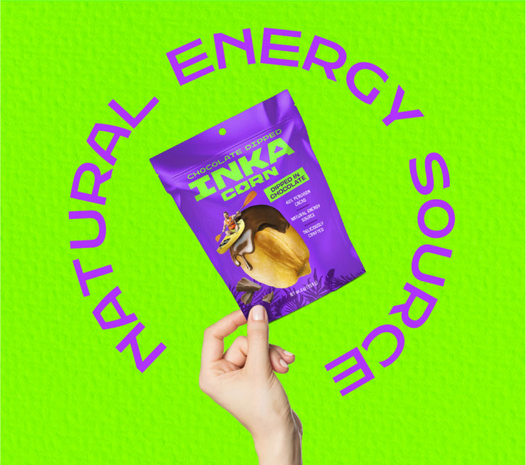
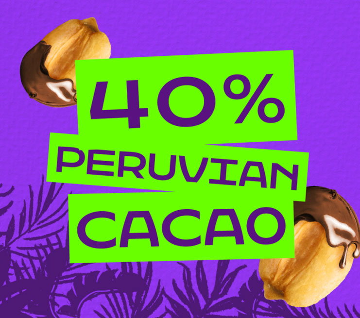
Building upon a vibrant color palette, dynamic collage imagery, and oversized product hero shots, we developed a cohesive graphic system designed to complement the packaging across social media platforms and e-commerce touchpoints. This flexible visual ecosystem amplifies the brand’s digital presence, ensuring high impact, consistency, and engagement at every online shelf.

The Result
A contemporary packaging system that positions Inka Corn to compete head-to-head with global leaders. The brand successfully reclaimed relevance and presence in international markets while maintaining an authentic connection to its Peruvian roots.