Client — Frigorífico Sirsil
Honoring Tradition through Pure Identity
00.
Project Overview
The Challenge
Frigorífico SIRSIL faced the challenge of consolidating its brand and positioning itself as a prominent player within the Uruguayan meat processing industry. Despite its long-standing track record and production capacity, the brand lacked a defined strategy and a consistent graphic system to organize its communication and amplify its value proposition.
The objective was to build a solid, recognizable identity aligned with its essence: a family-owned Uruguayan company committed to quality and the purest expression of national beef.


Our Approach
The process began with a diagnostic phase aimed at gaining a deep understanding of the current landscape, the existing brands, opportunities for improvement, and the sector’s competitive context. Based on this analysis, we defined the Brand Strategy under the guiding concept:
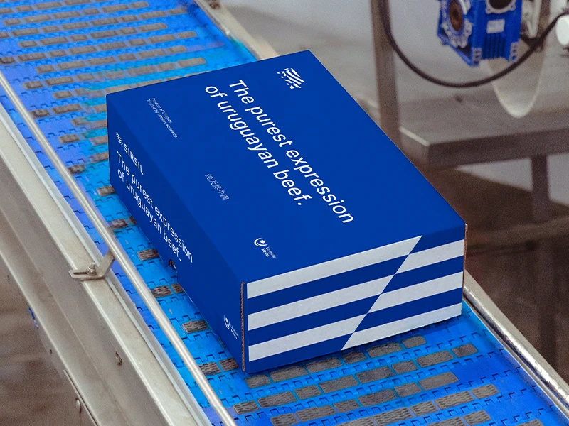
“The purest expression of Uruguayan beef.”
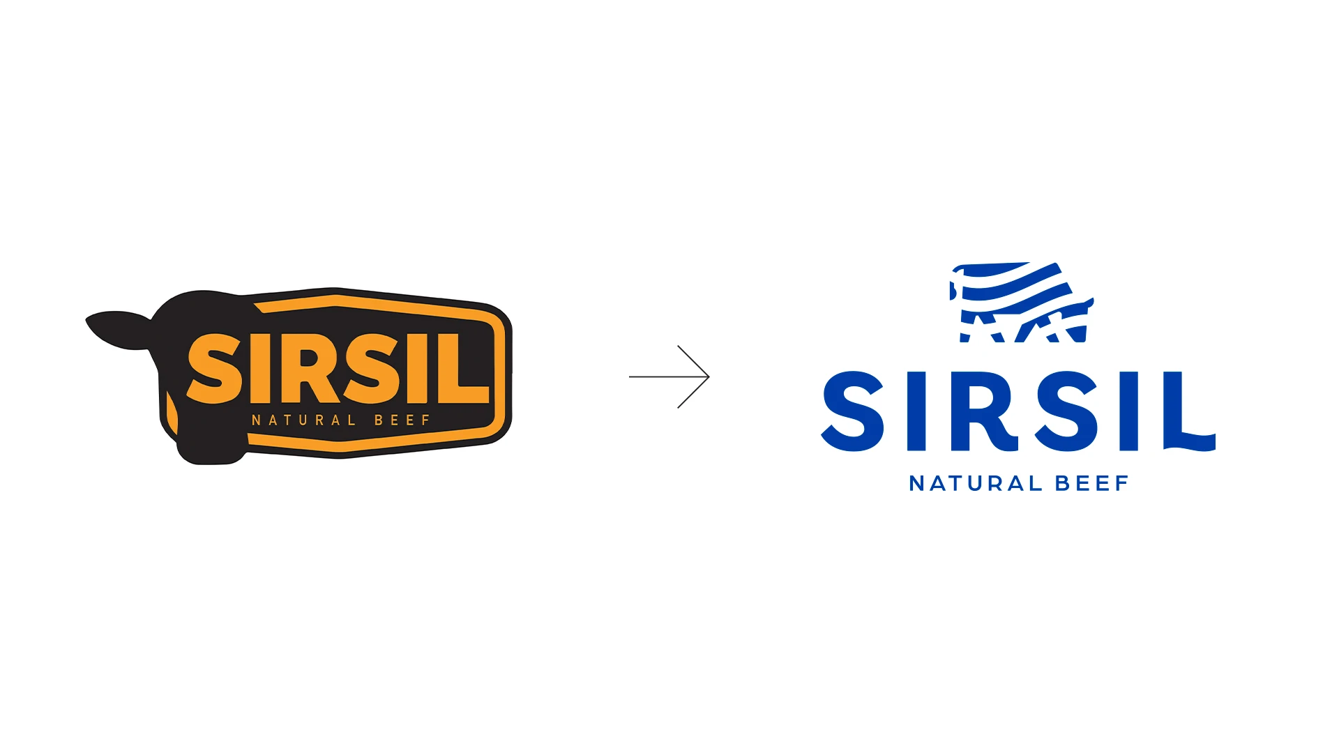
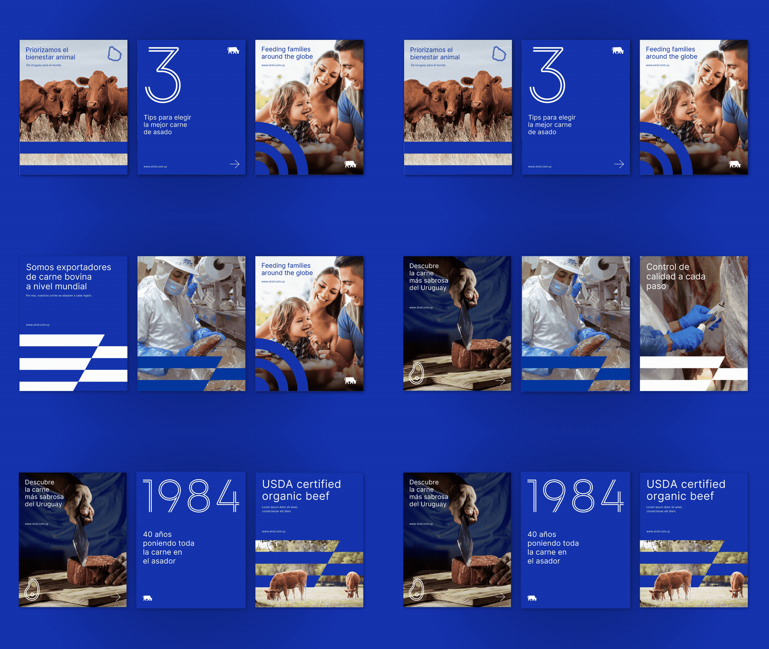
This strategy became the core pillar for the entire identity and communication system. We worked on revitalizing the logo, providing a more modern aesthetic, and developing a comprehensive graphic system to streamline all brand applications while ensuring consistency and recognition.

-
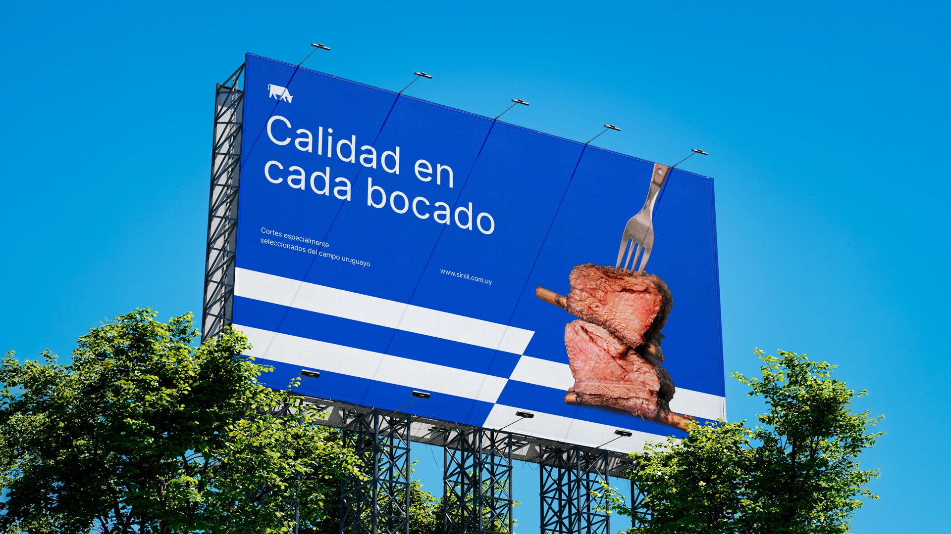
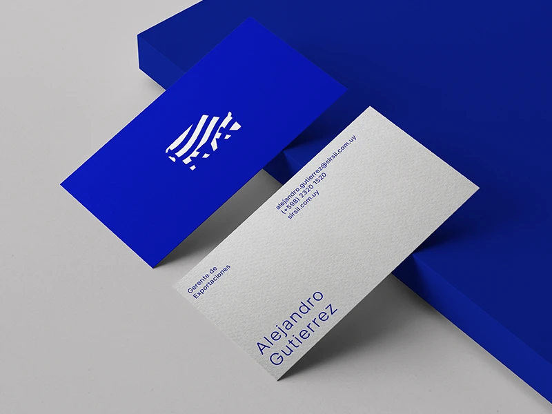
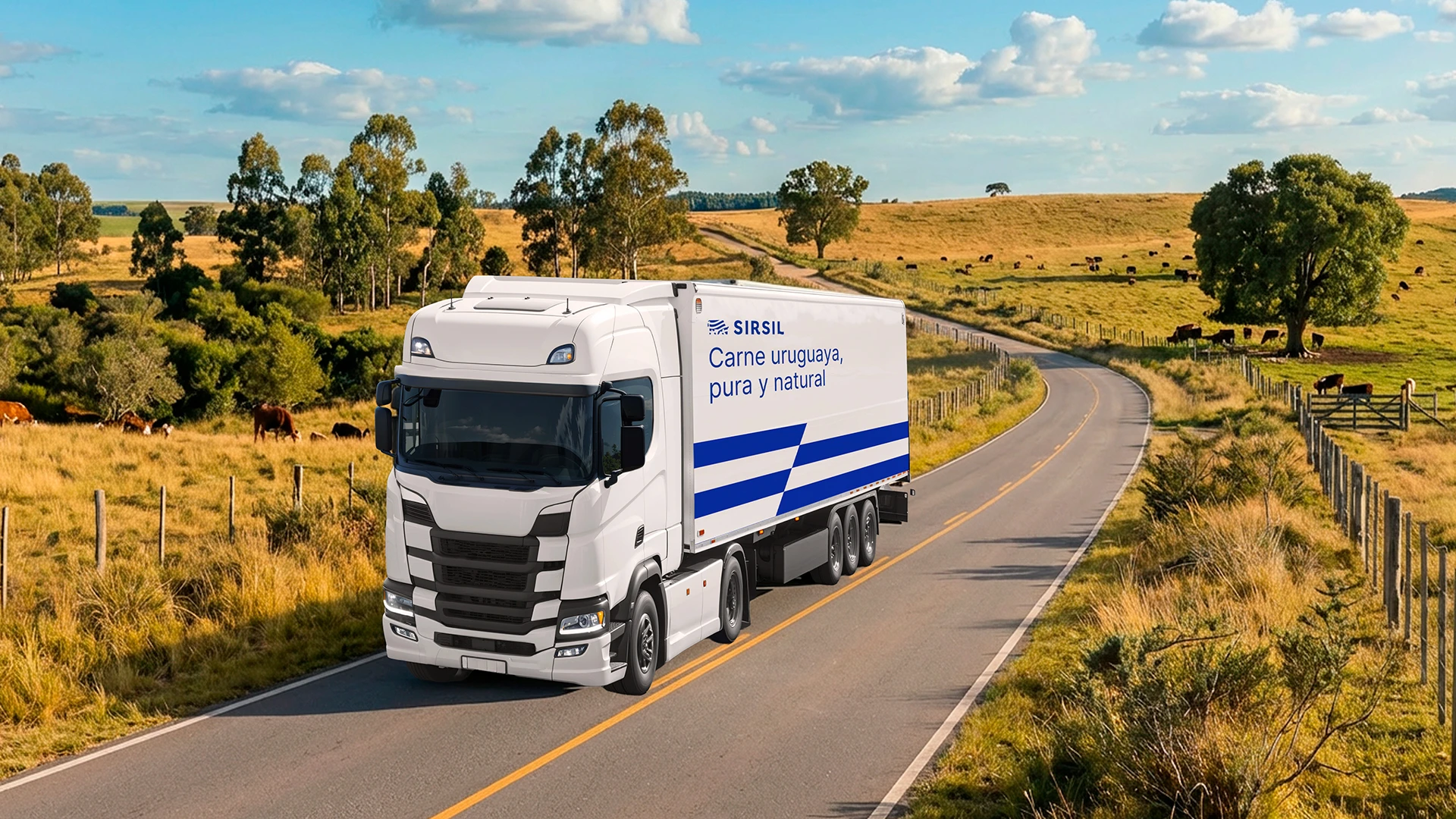
The new identity is rooted in the colors and stripes of the Uruguayan flag. The isotype features the silhouette of a cow integrated with blue stripes, reinforcing national origin as a strategic differentiator. Blue and white make up the primary palette, complemented by copper for applications requiring a more premium positioning.
The Result
The rebranding provided Frigorífico SIRSIL with a clear, coherent identity aligned with its business strategy. Today, the brand consistently communicates its three fundamental pillars: quality, family, and 100% Uruguayan origin.
The new graphic system not only strengthened SIRSIL’s positioning within the industry but also optimized internal design and communication processes, facilitating the creation of new assets and ensuring a solid image across all touchpoints.
The result is a brand that clearly expresses who it is, where it comes from, and what sets it apart: the purest expression of Uruguayan beef.