Client — Interfase
Interfase | Brand Evolution for a Regional Tech Partner
Project Overview
The Challenge
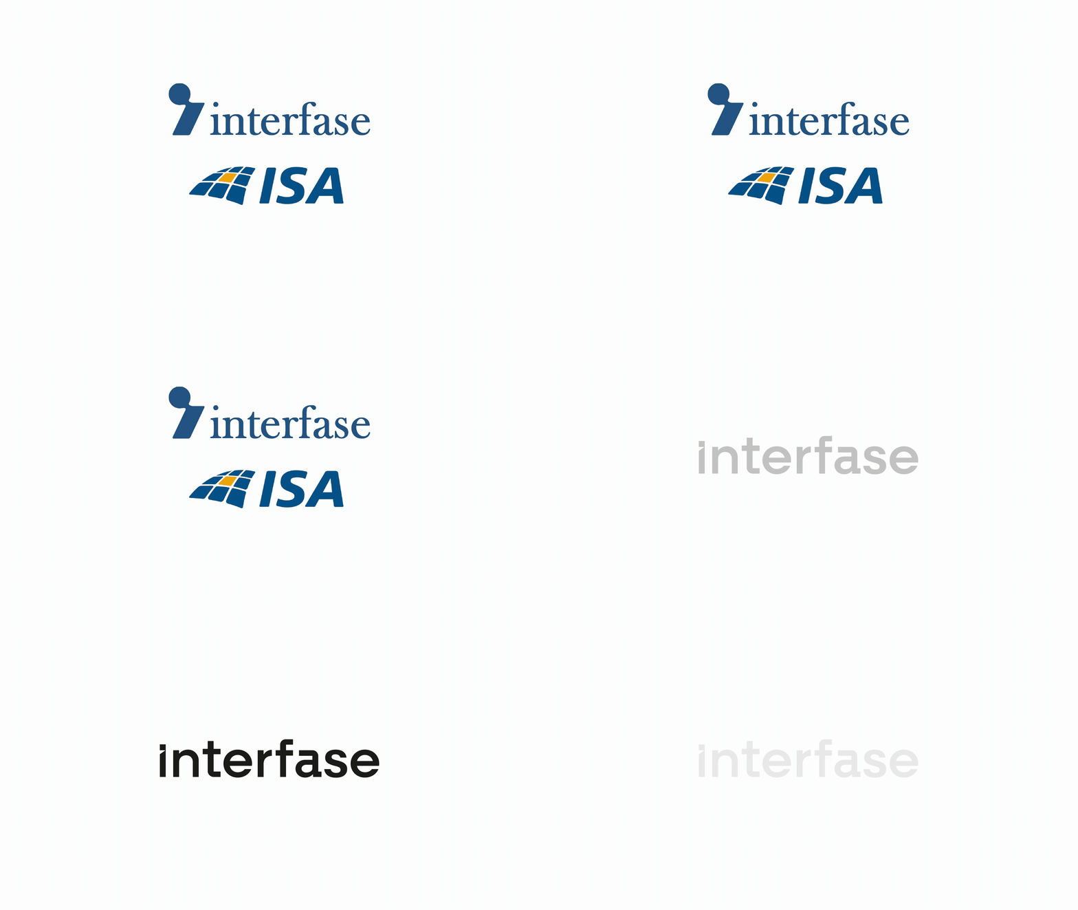
Following the merger of Interfase and ISA, the organization sought to strengthen team integration and drive synergy across its processes. With internal teams previously operating under disparate visual standards and distinct corporate email domains, the primary challenge lay in consolidating a unified culture. The project demanded a strategic evolution toward a single, contemporary brand that reflected their vision for growth and their current role as a benchmark technology partner in the region.
Our Approach
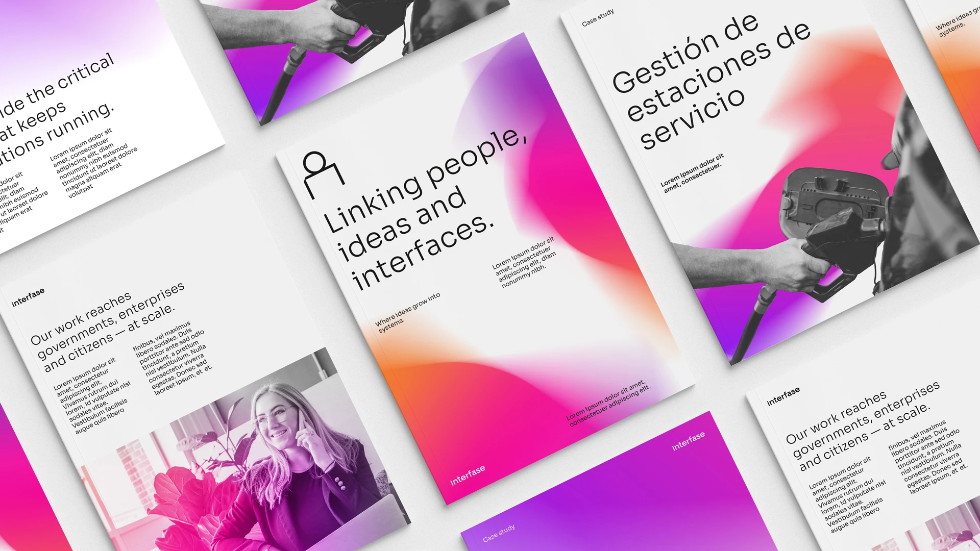
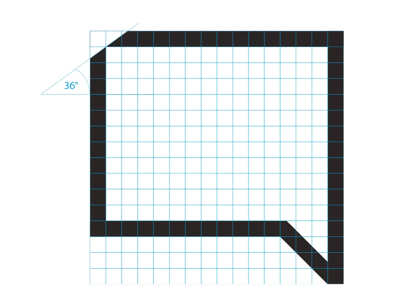
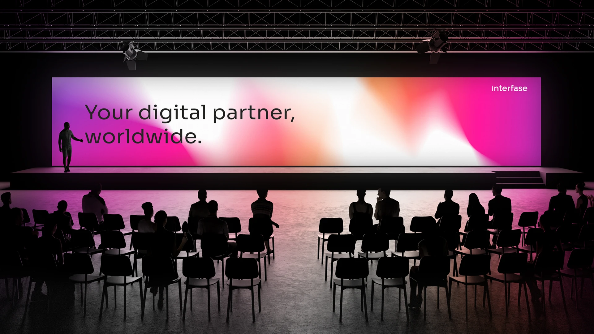
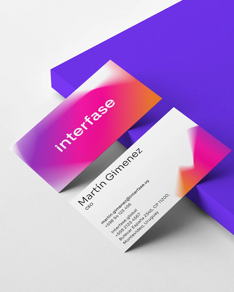
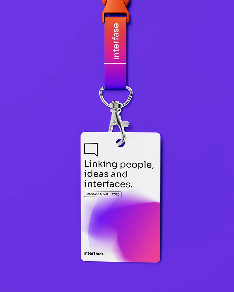
We simplified the name to “Interfase” and developed a comprehensive visual system that communicates both technological innovation and corporate solidity. We designed a visual language anchored by clean typography and a vibrant color palette, projecting a modern and forward-thinking edge. Additionally, we created a proprietary iconography set inspired by the new brandmark to ensure a cohesive and professional identity across all contexts—from highly technical communications to corporate positioning.

The Outcome
The result is a robust, contemporary identity that unifies the organization under a single purpose and culture. This transformation not only optimized brand management and asset production costs but also fostered a powerful sense of belonging within the team. Today, the brand reflects the organization’s institutional maturity, projecting an image of trust and professionalism that backs its international expansion and its capability to spearhead complex technological challenges.